Visualizations & Interactions
We can help you sort through vast amounts of data in real-time, or just making that bar chart "work."
Major Projects
At Navis, Andy built an interactive "recap report"-- described by an Apple engineer as a "spreadsheet on steroids". This provide real-time mission-critical visualization of 1000s of containers as they moved throughout container yards and onto ships, with dynamic drilldown and filtering.
Integrated map views of schools into the Great Schools site. This also included using geocoding data to group schools into "cities", and provide "nearby cities" functionality to parents considering a move.
On Bedsider, Andy built interactive birth control method browser and compare. Although this is a small data set, the idea was to encourage women to dive into the available methods. On Bedsider, Andy also built a series of graph widgets to express data as animating bar charts, "bubble charts", and tree maps. (No demo available)
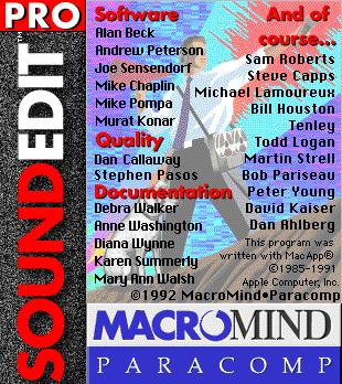
In the early 1990s, as UX Specialist and Team Lead of SoundEdit 16 (released by Macromind), I developed the next generation of visual sound editing software.
Small Projects & Prototypes
Interactive
Git Visualization: This
interaction demonstrates how how Git works from a high level. This prototype synthesizes
command-line documentation with a map view to create a useful teaching tool, showing
how code flows between the different buckets of git.
Feedback has been very positive, and it was featured on the front page of Hacker News.
&what; is a programmer utility to discover various character entities. Works as a standalone offline HTML5 app.
prototypeAgile Processes: A quick visualization to understand the differences between "agile", XP, scrum, etc using a force-directed graph. Written in pure Javascript.
prototypeUX Spoke: The
idea of this prototype is to spur software creators to consider different ways of getting feedback from users.
Software professionals can
use the "hammer" technique-- if the only tool you have is a hammer, then every problem looks
like a nail. We saw this over and over (and in ourselves), and wanted to build a tool that would
"mix it up" a bit.
Instead of listing the various activities of user research, our "interaction" starts
with the questions you might have about the product. And from there suggests potential activities.
Andy built the first prototype of CarbonFive's Story Mapper and contributed to ongoing development and project management. (Requires Pivotal Tracker login)
prototype A quick chart of the programming languages Andy has used. Created to demonstrate concise CSS and Javascript style in an hour.